Thursday, April 4, 2013

User Experience!

In Garrett's "The Elements of User Experience", he discusses the importance of user experience and how greatly it impacts a good/bad day, and therefore, how much it impacts a company's or product's success. Everyone has had positive and negative experiences regarding user experience with a product. Garrett talks about the user experience disappointments with a coffee maker and alarm clock. Oh boy, if those two things don't work and don't have a good user experience, there are a lot of people having very bad mornings.

The first thing I thought of when I thought of products whose user experience had let me down was a pencil sharpener. Now, some people may not have had the same conundrum that I experienced with pencil sharpeners. You'd go and pick out a pencil sharpener from Staples, and you'd pick the sleek looking sharpener or the smallest sharpener. However, almost as soon as you got home, the disappointment might hit! The sharpener wouldn't sharpen evenly!!!! You'd have one facet of the pencil tip completely sharp, and the others would be that paper/wood covering.

User experience is also directly applied to the web. A website needs to have a fantastic user experience in order to keep people coming back to their website, and not leaving for "something thats easier to use." So, how do people combine good aesthetics, good function, and good user experience?? Garrett points out five elements (or layers) that allow people to start creating a good user experience:

1. The Surface Plane
2. The Skeleton Plane
3. The Structure Plane
4. The Scope Plane
5. The Strategy Plane

Monday, April 1, 2013

How To Make a Website Wonderful

There is so much that goes into making an effective, successful, and easy to navigate website. Anyone that has access to the World Wide Web has stumbled upon websites that have been wonderful to use, and that we therefore continue to go back to and visit, and we have found websites that are highly irritating and don't make any kind of sense. The website we like we visit again, and the ones that are lacking are ones we avoid by all costs. So, what makes an effective and enjoyable website??

A good place to start when designing or making a website would be to really know your audience. Know the people you are tying to target and tailor your website to what those people want. Redish essentially states that there are seven characteristics for each audience:

1. Key phrases or quotes
2. Experiences, expertise
3. Emotions
4. Values
5. Technology
6. Social and cultural environments
7. Demographics

All of these characteristic help a creator to better understand their audience, and therefore, create a website that users will respond positively towards.

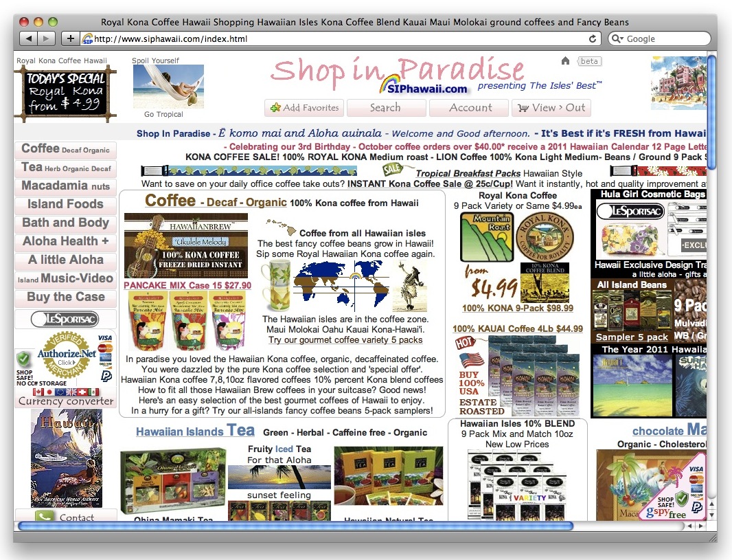
Another very critical element of having a successful webpage is to have a very organized and efficient homepage. A website's homepage is the first thing that a viewer will see when going to the website, and if a homepage isn't easy to use and clearly laid out, people will leave the website and find somewhere else to get the information they are seeing. Here are two examples of home pages, one is good and one is bad:

Good Homepage
Bad Homepage


This J. Crew homepage is very clean, organized, and has a good use of color that enhances the webpage and does not detract from the material or aesthetic. This example of a bad homepage is for some sort of company where you can buy Hawaiian goods. The homepage is so cluttered that the viewer can barely find what exactly the website has to offer. Someone who is looking to buy something off the internet is much more likely to buy something from a company with a homepage like the J. Crew page, not the webpage like the Hawaiian goods page.

Thursday, March 28, 2013

What is Your POV???

Point of views are part of our life on a regular basis. We are bombarded by them. Every class we go to, the material is given from the point of view of the professor. Every piece of gossip shared with us is given from the perspective of the sharer. Every essay we write, is written from our point of view.

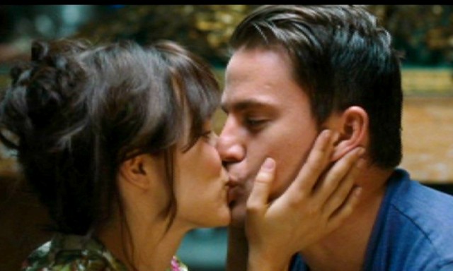
This same idea of point of view is applied to videos! Every video and/or image is presented to the audience from a point of view. As stated in Point Of View, "point of view is one of the most basic and interesting narrative devices available to the storyteller". One way that the point of view of the storyteller can be shown is from actual point of view shots. For example, if the narrator/storyteller for a narrative is an "outsider" point of view, the audience might get a shot of the two individuals in a scene talking or doing something together. From this scene in The Vow, the audience is seeing the scene unfold from the camera's point of view, not any of the characters in the story.


Point of view can also be very confusing to an audience if not handled with care and with tact. Think...have you ever seen a movie or video where the point of views were switching frequently or where you couldn't figure out who the narrator was? This can be frustrating to an audience member. Having point of views rotate between characters can be an effective way to tell a story, but the person dictating that must be mindful and careful with this switching.

Tuesday, March 26, 2013

The Importance of Continuity

There was a lot discussed in The Aesthetic of Editing. To try to cover everything that was discussed in a blog post would be near impossible because I could legitimately go on and on. However, one point I found particularly interesting was that discussion on CONTINUITY.

"Continuity refers to maintaining story consistency from shot to shot and within scenes" ( p. 235). Continuity is so important to any video, whether its a million dollar mega-hit movie shown all over the country, or a simple five minute video made for a digital communication class. Simple things like if an individual has her hair down in one shot and up in the next can compromise the continuity of a video and/or film.

Technical continuity is also imperative to the successful translation of the video to the audience. Audio levels is one example of something that needs to be continuous through a film/video. One thing that has been emphasized in class while talking about our Podcasts and our upcoming videos is the importance of keeping audio levels continuous and stable. To be able to keep people's speaking constant even when in contrast to background music makes the viewing/listening experience much easier and much more pleasing for the audience. This continuity is also important because if not properly balanced, the music is very capable of overpowering and drowning out interviews which is the more important component of a video.

Thursday, March 21, 2013

The Powers That Be...On the Screen


In The Two Dimensional Field: Forces Within the Screen, Zettl discusses the different technical elements that have a strong pull and impact on the screen. Zettl talks about several important elements including:

1. Horizontal/Vertical
2. Up/Down Diagonals
3. Framing
4. Attraction of Mass
5. Asymmetry (between screen left and screen right)
6. Figure and Ground
7. Gestalt
8. High and Low definition images
9. Vectors

All of these elements effect the composition of an image and how the viewer/audience sees and interprets the image. 

One of these elements that I found particularly interesting is that of framing and the attraction of mass. Frames create strong pulls. These strong pulls, pull towards the corners of a frame, and therefore, create a strong pull of objects in that frame towards the corners. This ties directly into the attraction of mass. As Zettl says, “graphic mass attracts graphic mass” (Zettl, p. 123). Therefore, an object with a larger graphic mass will usually attract something with a smaller mass. This also leads to an object with a larger graphic mass being more independent in a frame then something with a smaller graphic mass, which often is dependent on the object with the larger graphic mass. 

As a photographer or videographer, it is important to keep the idea of framing and attraction of mass in mind when filming or shooting anything. If these concepts are neglected, it could potentially cause the image to lack effectiveness, or cause a miscommunication between the photographer/videographer and the audience. 


Tuesday, March 12, 2013

Fantastic Flash Documentaries!


In Anders Fagerjord’s, Multimodal Polyphony, he discusses the importance and use of multimodal polyphony on the world wide web. We are constantly surrounded by different mediums: writing, images, music, and videos. 

One way that all these mediums were combined was in Flash Documentaries that became popular on the internet in 2000 and 2001. As Fagerjord describes, “Using media’s Flash software, Web authors were able to create documentary films of still images and voice-over commentary, and distribute them as files small enough for Web download. These are narrated, timed slideshows, where still images are ‘made moving’ by moving the frame in panning, tilting, or zooming the image” (Fagerjord, p. 2). Until this article, I had never really heard of these Flash Documentaries, but these are very similar to what we are doing with our slideshows presently. We are taking our still image pictures and combining them with commentary.

These flash documentaries do three important things for us as viewers:
  1. We can take in the experience by looking and listening.
  2. The language and photos are both dynamic, so rhythm and time become an important factor.
  3. We isolate different devices that are inspired by rhetoric and can be used again by other people.

In order to be able to make a flash documentary effective and meaningful for viewers, the writing, photography (images), music, sound effects, and narration must all come together in a symbiotic way. Everything must be timed correctly, arranged correctly, and communicated correctly in order to effectively convey the narrative of the documentary. These are all important things to keep in mind while working on our next project in class!

Here is an example of a flash documentary I found online: