Tuesday, April 23, 2013

Cyber vs. Reality


Virilio's chapter on Cybersex was very interesting to me. I am not going to lie, I have had many a conversation with my apartment mates about what the "cyber" has done for sex. I am also currently in a human sexuality class and this has been something that we discussed in detail. 

Digital sex, whether that comes in the form of porn or actual cybersex, is a controversial thing. Having sex so available online can desensitize and turn people off from the real and actual.

This idea can also be tied into people preferring the digital over the actual in general. People choose to re connect with old flames rather then go out and meet new people in the workplace/bars/mutual friends. We are living in a world that can make it so easy to never need/want to have that "human interaction". 

Virilio has really sparked some mixed feelings in me. I don't know whether to love and agree with the man, or vehemently disagree with him. I think that he brings up some wonderful points that demand thought. My conclusion from Virilio's writings are this: Technology CAN BE a dangerous thing, and if used in certain ways can really damage people and the world that we live in. However, it is then our charge by Virilio to step up as communication majors, and to study digital media and to learn how to use it to enhance our world and not damage it. 

Technology should not be feared, but it should be valued and evaluated on an almost daily basis. It should be seen as a tool for good, and not for evil. This digital media is not going anywhere, so its our job to embrace it and make it the best for this world that it can be.

Thursday, April 4, 2013

User Experience!

In Garrett's "The Elements of User Experience", he discusses the importance of user experience and how greatly it impacts a good/bad day, and therefore, how much it impacts a company's or product's success. Everyone has had positive and negative experiences regarding user experience with a product. Garrett talks about the user experience disappointments with a coffee maker and alarm clock. Oh boy, if those two things don't work and don't have a good user experience, there are a lot of people having very bad mornings.

The first thing I thought of when I thought of products whose user experience had let me down was a pencil sharpener. Now, some people may not have had the same conundrum that I experienced with pencil sharpeners. You'd go and pick out a pencil sharpener from Staples, and you'd pick the sleek looking sharpener or the smallest sharpener. However, almost as soon as you got home, the disappointment might hit! The sharpener wouldn't sharpen evenly!!!! You'd have one facet of the pencil tip completely sharp, and the others would be that paper/wood covering.

User experience is also directly applied to the web. A website needs to have a fantastic user experience in order to keep people coming back to their website, and not leaving for "something thats easier to use." So, how do people combine good aesthetics, good function, and good user experience?? Garrett points out five elements (or layers) that allow people to start creating a good user experience:

1. The Surface Plane
2. The Skeleton Plane
3. The Structure Plane
4. The Scope Plane
5. The Strategy Plane

Monday, April 1, 2013

How To Make a Website Wonderful

There is so much that goes into making an effective, successful, and easy to navigate website. Anyone that has access to the World Wide Web has stumbled upon websites that have been wonderful to use, and that we therefore continue to go back to and visit, and we have found websites that are highly irritating and don't make any kind of sense. The website we like we visit again, and the ones that are lacking are ones we avoid by all costs. So, what makes an effective and enjoyable website??

A good place to start when designing or making a website would be to really know your audience. Know the people you are tying to target and tailor your website to what those people want. Redish essentially states that there are seven characteristics for each audience:

1. Key phrases or quotes
2. Experiences, expertise
3. Emotions
4. Values
5. Technology
6. Social and cultural environments
7. Demographics

All of these characteristic help a creator to better understand their audience, and therefore, create a website that users will respond positively towards.

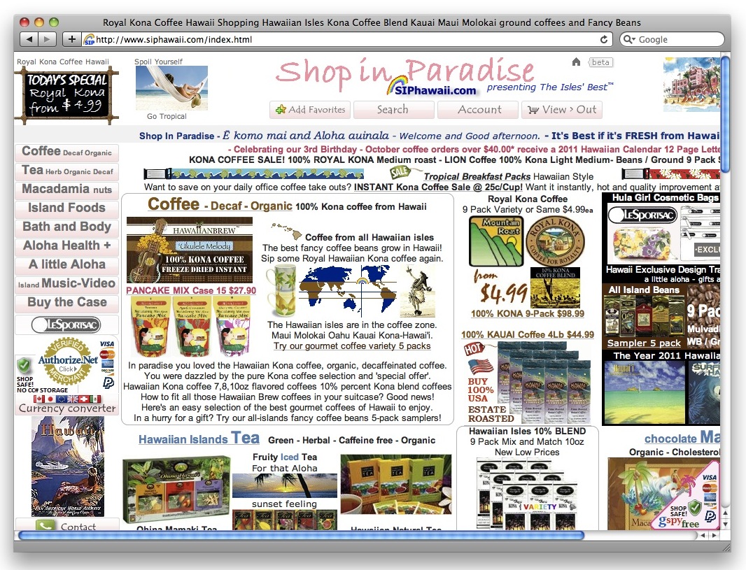
Another very critical element of having a successful webpage is to have a very organized and efficient homepage. A website's homepage is the first thing that a viewer will see when going to the website, and if a homepage isn't easy to use and clearly laid out, people will leave the website and find somewhere else to get the information they are seeing. Here are two examples of home pages, one is good and one is bad:

Good Homepage
Bad Homepage


This J. Crew homepage is very clean, organized, and has a good use of color that enhances the webpage and does not detract from the material or aesthetic. This example of a bad homepage is for some sort of company where you can buy Hawaiian goods. The homepage is so cluttered that the viewer can barely find what exactly the website has to offer. Someone who is looking to buy something off the internet is much more likely to buy something from a company with a homepage like the J. Crew page, not the webpage like the Hawaiian goods page.

Thursday, March 28, 2013

What is Your POV???

Point of views are part of our life on a regular basis. We are bombarded by them. Every class we go to, the material is given from the point of view of the professor. Every piece of gossip shared with us is given from the perspective of the sharer. Every essay we write, is written from our point of view.

This same idea of point of view is applied to videos! Every video and/or image is presented to the audience from a point of view. As stated in Point Of View, "point of view is one of the most basic and interesting narrative devices available to the storyteller". One way that the point of view of the storyteller can be shown is from actual point of view shots. For example, if the narrator/storyteller for a narrative is an "outsider" point of view, the audience might get a shot of the two individuals in a scene talking or doing something together. From this scene in The Vow, the audience is seeing the scene unfold from the camera's point of view, not any of the characters in the story.


Point of view can also be very confusing to an audience if not handled with care and with tact. Think...have you ever seen a movie or video where the point of views were switching frequently or where you couldn't figure out who the narrator was? This can be frustrating to an audience member. Having point of views rotate between characters can be an effective way to tell a story, but the person dictating that must be mindful and careful with this switching.

Tuesday, March 26, 2013

The Importance of Continuity

There was a lot discussed in The Aesthetic of Editing. To try to cover everything that was discussed in a blog post would be near impossible because I could legitimately go on and on. However, one point I found particularly interesting was that discussion on CONTINUITY.

"Continuity refers to maintaining story consistency from shot to shot and within scenes" ( p. 235). Continuity is so important to any video, whether its a million dollar mega-hit movie shown all over the country, or a simple five minute video made for a digital communication class. Simple things like if an individual has her hair down in one shot and up in the next can compromise the continuity of a video and/or film.

Technical continuity is also imperative to the successful translation of the video to the audience. Audio levels is one example of something that needs to be continuous through a film/video. One thing that has been emphasized in class while talking about our Podcasts and our upcoming videos is the importance of keeping audio levels continuous and stable. To be able to keep people's speaking constant even when in contrast to background music makes the viewing/listening experience much easier and much more pleasing for the audience. This continuity is also important because if not properly balanced, the music is very capable of overpowering and drowning out interviews which is the more important component of a video.

Thursday, March 21, 2013

The Powers That Be...On the Screen


In The Two Dimensional Field: Forces Within the Screen, Zettl discusses the different technical elements that have a strong pull and impact on the screen. Zettl talks about several important elements including:

1. Horizontal/Vertical
2. Up/Down Diagonals
3. Framing
4. Attraction of Mass
5. Asymmetry (between screen left and screen right)
6. Figure and Ground
7. Gestalt
8. High and Low definition images
9. Vectors

All of these elements effect the composition of an image and how the viewer/audience sees and interprets the image. 

One of these elements that I found particularly interesting is that of framing and the attraction of mass. Frames create strong pulls. These strong pulls, pull towards the corners of a frame, and therefore, create a strong pull of objects in that frame towards the corners. This ties directly into the attraction of mass. As Zettl says, “graphic mass attracts graphic mass” (Zettl, p. 123). Therefore, an object with a larger graphic mass will usually attract something with a smaller mass. This also leads to an object with a larger graphic mass being more independent in a frame then something with a smaller graphic mass, which often is dependent on the object with the larger graphic mass. 

As a photographer or videographer, it is important to keep the idea of framing and attraction of mass in mind when filming or shooting anything. If these concepts are neglected, it could potentially cause the image to lack effectiveness, or cause a miscommunication between the photographer/videographer and the audience. 


Tuesday, March 12, 2013

Fantastic Flash Documentaries!


In Anders Fagerjord’s, Multimodal Polyphony, he discusses the importance and use of multimodal polyphony on the world wide web. We are constantly surrounded by different mediums: writing, images, music, and videos. 

One way that all these mediums were combined was in Flash Documentaries that became popular on the internet in 2000 and 2001. As Fagerjord describes, “Using media’s Flash software, Web authors were able to create documentary films of still images and voice-over commentary, and distribute them as files small enough for Web download. These are narrated, timed slideshows, where still images are ‘made moving’ by moving the frame in panning, tilting, or zooming the image” (Fagerjord, p. 2). Until this article, I had never really heard of these Flash Documentaries, but these are very similar to what we are doing with our slideshows presently. We are taking our still image pictures and combining them with commentary.

These flash documentaries do three important things for us as viewers:
  1. We can take in the experience by looking and listening.
  2. The language and photos are both dynamic, so rhythm and time become an important factor.
  3. We isolate different devices that are inspired by rhetoric and can be used again by other people.

In order to be able to make a flash documentary effective and meaningful for viewers, the writing, photography (images), music, sound effects, and narration must all come together in a symbiotic way. Everything must be timed correctly, arranged correctly, and communicated correctly in order to effectively convey the narrative of the documentary. These are all important things to keep in mind while working on our next project in class!

Here is an example of a flash documentary I found online:

Thursday, February 28, 2013

Are you hearing, listening, or both?

In The Zen of Listening, the idea of listening and hearing is discussed. It says, "We can passively hear, but we must actively listen." This concept is something that I find to be so important. Its like when you are having a conversation with someone. You can passively hear what they are saying and know what words they are forming, how they are stringing them together, and what those equal. However, to actively listen, one must be able to understand the words, understand what together they mean, AND THEN to understand the context and understand what the other person is trying to entirely communicate.

Radio is a form of audible transmission that people have loved for years!! It has a nostalgic hold on people, whether you are tuning in for talk radio (like NPR) or just some good tunes. While listening to radio, as consumers, we are constantly switching back and forth between hearing and listening. We are hearing when we just hear the different sounds, instruments, and words of a song. We are listening when we hear what the combination of all those things is trying to convey to us as a listener.

Monday, February 25, 2013

Slideshow!!!!

Slideshow Photo Editing!


I really enjoyed getting to play around with Photoshop with this slideshow. I didn't do anything too crazy with my photo editing because I was trying to think in terms of if these pictures were being used on Furman's Housing and Residence Life page they would want them to look like the real thing with simple adjustments to enhance the photographs. The six photos I chose to post to my blog shows the more dramatically or tricky to edit photos. However, pretty much all the photos were edited in some manner (cropping and light adjustment).


Picture 1:

For these photos, I adjusted the color and the contrast to make the colors more vivid. I also made a layer with the text so that it was easily identifiable to people who don't know or recognize the building.


Picture 2:

In this photo I cropped the bottom because it was just a lot of extra space that was unnecessary. I also had the text layer to show make clear what the viewer was looking at. The most important thing I did was to adjust the contrast so that the Greek letters were crisper and could be read better against the brick.


Picture 3:

For these photos I cropped some of the excess sides out. I also tried to do something artsy with the black and white photo, and also highlighting the two faces in the photo in white.
Picture 4:
In this picture I played with the lighting a bit because of the night time photography on my phone. I also added a text layer in order to label the picture of what was going on, because by looking at the photo it isn't entirely clear.


Picture 5:


This photo was actually a trickier one for me. The original photo I took really was not doing the colors in the bedspread justice and just looked very dull. So, I played around with the brightness and the contrast of the photo to get a more authentic look of the room. I also put the text overlay on the photo.


Picture 6:

This photo was probably the photo that I went back and forth on the most editing wise. I didn't like all the reflections that the mirrors were casting in each other so I cropped most of the mirrors out so that it was really focused on the bathroom vanity sink. However, I am not entirely sure whether that did the bathroom a justice or injustice. I also slightly adjusted the crispness and lighting in the photo.

Wednesday, February 20, 2013

Given and New in Composition!


The composition or layout of a web page can greatly hinder or highlight the page’s content. Of course, this idea pertains to the text presented on a page. Having hard to read text, bad color choice, text that is too small, or text that is all concentrated in one are of a page can negatively impact a reader’s experience. However, this importance of composition and layout is also very essential to the effectiveness and meaning ascribed to images. 

One of my favorite points that Kress and Leeuwen addressed in the reading The Meaning of Composition is the idea of the “new” and the “given. Kress and Leeuwen writes, “For something to be Given means that it is presented as something the viewer already knows, as a familiar and agreed-upon point of departure for the message. For something to be New means that it is presented as something which is not yet known, or perhaps not yet agreed upon by the viewer, hence as something to which the viewer must pay special attention.”

The eye is trained to, accustomed to, and comfortable with reading from left to right. This makes sense with how the concept of Given and New images are then articulated in a composition. Something that is a Given image is often presented on the left side of a layout, while something that is New is often presented on the right side of a layout. 

Some of the examples shown in the reading were really dark because of the scanning, so I tried to find a good example on my own. Hopefully I am not too far off track! I found this article and thought it was a good, yet very basic example of this Given and New principle. 

The Proactive website opens and you see scrolling images on the left of beautiful famous people with gorgeous skin, and on the right you see the three step proactive system. The Given then is that “these women have gorgeous skin” the New is that “you can get that skin with Proactive!”


Tuesday, February 19, 2013

You, the Viewer, Making Meaning!


In the reading, Viewers Make Meaning, Cartwright and Sturken discuss the important and determining role that viewers play in giving an image its effective meaning. They list three ways, other then the image and the producer, that an image is given meaning:

  1. the codes and conventions that structure the image and that cannot be separated from the content of the image
  2. the viewers and how they interpret or experience the image
  3. the contexts in which an image is exhibited and viewed

All these things listed are produced by the viewer and the environment surrounding the image and the viewer of the image. 

Another concept discussed in the article that I found very interesting was the idea of interpellation. “To be interpellated by an image, then, is to know that the image is meant for me to understand, even if I feel that my understanding is unique or goes against the grain of a meaning that seems to have been intended.” When I read this advertising was a natural thought in my mind. 

Beer commercials are always stand outs for me. I know that they often aren’t marketed towards me because I am a woman, but some of them I find highly entertaining. Beer commercials interpellate me because I know what they are intending to do even if they are not targeting me, and to some degree the effectiveness (or cleverness) of a beer commercial does convince me to buy a brand. One beer commercial that I adore is by Heineken:

BEER CLOSET COMMERCIAL

ENJOY!!!

Thursday, February 14, 2013

Be Wary of the Image!


Its important to recognize that images do not equal reality. In the reading Images, Power, and Politics by Sturken and Cartwright, the point of being educated/informed and wary of looking at images is emphasized.

Images are incredibly powerful and can communicate a lot to a viewer. However, its important to remember that images/photographs are still very subjective. There are two big ways that they are:

1. The viewer's experiences and background.
2. The photographer chooses everything.

The way that everyone sees an image is very different because everyone is coming from different experiences. One great example is the example of the Confederate flag. For some people, that image is an image that evokes the ideals of heritage, pride, and Southernness. However, having not grown up in the South (and not having any Southern heritage), the image of the Confederate flag does not evoke positive emotions for me. It evokes prejudice, slavery, and racism. Neither perception of the image is "less powerful" then another, it is simply powerful in a different manner.

Confederate Flag evokes different reactions to the same image


The second thing to remember is that the photographer that takes a picture chooses when to take the picture, how to take the picture, what part of the scene to focus on, and then how to edit a photo. What that means is that a photo can't completely represent full "realism" in news/media/digital media because someone is still manipulating the image that we, the viewer, are seeing. 

This reading was of particular interest to me because I do find that when I see a picture in the news I tend to take it at face value. I often don't stop to consider all the work that went on behind the scenes with the choosing of the shot and then the manipulation of it. I, in no way, think that this "wariness" of images distracts from the potential power of images, it just requires the viewer to be a bit more informed!

Tuesday, February 12, 2013

Different Portrayals of Women in Sports Photography


Photographs play a very important role in the world we live in. If used effectively and properly, photographs can so brilliantly capture the motion, energy, and essence of a moment. In Framed and Mounted: Sport Through the Photographic Eye, the role that photographs can play in sports is discussed.

It is important to note that “...but merely that many techniques are available to photographers that are ethically dubious and, whatever the motives of the photographer, a framed, two-dimensional image can never be ‘the thing itself’”. Photographs are meant to convey what is going on and the motion of the situation. Photographs accompanied by good captions or articles allow the photographs to really shine.

These still shots of sports also allow for a sort of sports social memory to be developed for sports, and answer questions like:

  • “Did you see that?”
  • “Do you remember when”
  • “What a bod?!”

Sports Illustrated was discussed a lot in the article for its highs and lows in sports photography. Sports Illustrated has done a good job at highlighting sports photography with well-written, informative, and credible articles. However, overall, the magazine has not demonstrated the most “gender-friendly” sharing of time. Very rarelely have women been put on the cover of Sports Illustrated, and even less then that is the number of times an African-American woman has appeared on the cover. When women are featured they are often featured in a overly sexualized manner. I think it is completely fine to have some sexualized photos of athletes, because lets be real, what girl would mind seeing some shirtless shots of some men soccer players. However, I think overall there needs to be a balance between the shots of powerful and athletically dominating women, and women provocatively posing for Sports Illustrated.

Non-sexualized sports photograph
Sexualized Sports Photograph


Wednesday, February 6, 2013

The Power of a Photograph

Quinn and Filak write about the power of an images as journalism in "Digital Still Photography". If used correctly and in an effective manner, a photograph has the ability to do all (and more) then an article or video can do. In many ways, images/still photographs are a universal language. Everyone can understand a visual image and the emotions and events that image captures, not everyone can read man article or understand the language in a video.

At one point, Quinn and Filak write, "use the power of the still image with its seeming permeance, but also harness sound and the energy of motion." When I read this, one photo immediately came to mind:


This still image shows a man standing in front of three encroaching tanks in Tiananmen Square. At this point, the Chinese military had just forcibly removed many Chinese protesters ( many of them students) from the Square the day before. The image fulfills what Quinn and Filak write about in terms of harnessing sound and energy of motion. The viewer can hear the humming if the tanks, can see the forward motion of the four tanks, and the solidarity and perseverance of the singer man. The viewer can also almost feel the tension of the situation surrounding the earlier happenings in Tiananmen.

When camera and editing technology began to flourish in the 1990s, getting to see these images (like the Tiananmen Square photo) became more frequent and accessible to viewers. Advanced equipment and the digitizing of media really opened up many possibilities and opportunities for photojournalists. As much as I appreciate reading a well-written news article, I would prefer the journalism has a well executed piece of photojournalism to accompany it.

Monday, February 4, 2013

Advertise Here!


"Citizen Journalists"

Blogging and journalism are two things that we have discussed in length during class. We have also spent a lot of time discussing whether all bloggers are journalists. The conclusion we came to was “no.”  In Rettberg’s article, “Citizen Journalists”, he discusses the difference and similarities of the two, and when the distinction or lack there of, is important.

Rettberg points out the three ways that blogs approach journalism:
  1. First-hand reports
  2. Bloggers as independent journalists and opinionists
  3. Gatewatching

Rettberg really strived to make the connection that mainstream media and independent blogs really rely on one another. This quote is one of my favorites from the reading, and sums up the chapter well. “Obviously, blogs are many different things. What appears to be clear, however, is the blogs need mainstream media, and that, today, the mainstream media also need blogs.”~ Rettberg

“Blogging Brands”

The combination of blogs and branding is one of the most interesting elements of blogging to me. For example, I enjoy a blog that we have talked about called Atlantic Pacific. With Atlantic Pacific, certain companies have sent her products to wear in her blog. She will then acknowledge that in her blog by putting “c/o” and then the brand name. For example: c/o J.Crew (because lets be real, if I was being sent clothes to feature on my blog, that is where I would want clothes from)!

Another way bloggers can make money blogging is when there blogs become visited enough and a popular enough blog, advertisers will pay to have their advertisements placed on their blogs. Thats right, now there is the chance that those annoying rollover advertisements could invade your favorite blog!


Thursday, January 31, 2013

1,2,3...Blogs I See!!

In chapter 7 of Brian Carroll's book, he discusses the different kinds of blogging. This is an element I hadn't fully thought about before reading this chapter. Carroll says that blogs fall into three categories:

1. Personal Blogs
2. Corporate Blogs
3. News Blogs

Now, before embarking on this wonderful journey of Digital Communication Class, I thought there was one kind of blog: personal blogs. However, I now see these three different types and the different purposes they serve. 

Personal blogs are individualized, typically focused on a certain interest of the blogger, and usually more conversational in tone.

Corporate blogs have one big goal: to keep their consumers updated on all things going on in their company. These blogs are also good for developing trust between the corporation and the consumer. Corporate blogs help to develop this trust by speaking plainly and humanizing the company. Another way to help build trust is by not directly trying to sell anything to people reading the corporate blog.

News blogs focus on what happened and are centered around factual events. This is the kind of blog that can sway into the category of journalism because it follow a particular method of verification.

Since I have joined this class, I have decided to embrace the world of blogging. I just started a Bloglovin account and follow blogs in each of these different categories. I am really enjoying seeing their different goals, tones, and approaches to blogging. Personally, I think I am partial to the personal blogs!

Sunday, January 27, 2013

Be Heard...the Modern Way!


Blogging, blogging, blogging! I am not going to lie, when we first ventured into the world of blogging for this class I was slightly intimidated. I didn’t know how to approach a blog for this class. Was it to be purely and dominated by academics or by my voice. I feel that the most posts I have done, the more comfortable I have gotten, that I am using my voice to begin to communicate the academic side of things. 

Along the lines of blogging, we read about blogging and the the communities surrounding them. In the beginning of chapter 3, so and so says “Everyone is famous to fifteen people”. I really enjoyed and was intrigued by the point that Rettberg made about the differences between print and blogging. Blogging really allows everyone to have an outlet and an opportunity to get their word out to the world. Print also allows for that to happen, but on a different scale. Rettberg talks about how things like fanzines and newsletters can be photo-copied and sent out to people, but blogs allow for that to happen as well. Blogs also offer the added benefit that more people can see the information due to the networks and communities that link bloggers to readers and other bloggers.

One of the examples that I immediately think of is the example of a school newsletter, specifically the Furman newsletter. It always amazes me when I go home for breaks to see the Furman University newsletter. I’m always so surprised and shocked to see some of the news and stories from the University, things I had no idea about while being at Furman. If Furman had a blog (even if it accompanied the newsletter), both parents and students could enjoy the benefits of a newsletter. And chances are that other people, even prospective students and families could also benefit from the advantages of a blog. Furman also having a blog could allow for more up-to-date announcements and stories and further Furman’s recognition.

Blogging allows for many possibilities for individual, corporations, and institutions to further their recognition and get their words out to people all over the world!


Thursday, January 24, 2013

A Girl's Right Hand Through Long Distance


My boyfriend went abroad to Chile this term. As I was anticipating him leaving, my Mom and Dad (ever so politely) reminded me that it won’t be that bad because of all the technology that I have at my fingertips. 

A little background...my Mom and Dad dated for eight years before they got married. Six of those eight years were long distance. All those years my parents had two ways to keep in touch with one another: snail mail and a telephone (and part of that time the telephone was stationed in the hall of a dormitory). Fast-forward 30 years, and I have email, iMessage, Skype, cell phones, and Facebook to all help me and my boyfriend stay in touch this term. 

Naturally having been told about all the years of snail mail, I assumed that none of these social media wonders were ever thought about until the 1980s, 1990s, and on. However, as Daniela Hernandez writes about in “Facebook?! Twitter?! Instagram?! We did that 40 Years Ago?!” these social media concepts were already around. Contraptions like the first ever smart phone, the IMB Simon phone, came about in 1993. The original way to Skype was first around in 1964, it was called the Bell Picturephone. It was a wacky shaped contraption and cost $16 dollars to make a 15 minute call. Oh, and the only place you even had the ability to use it? New York, D.C., and Chicago.

As Daniela showed us in her article, these social media contraptions were around earlier then the 1990s, they were just not available to everyone, impractical, and expensive. However, the ideas for the very honed and available programs and contraptions we have at our disposal today are what they are because of these original pioneers. So, thank you Bell Picturephone and IMB Simon Phone for leading in my right hand through these next few months!

My boyfriend embracing the use of Facebook and webcam!

Sunday, January 20, 2013

K.I.S.S. and Be Smart!!


Hyperlinks

I have always been amazed by hyperlinks! I've wondered how to get them and how to successfully know when to place a hyperlink. Brian Carroll gives great guidelines to hyperlinks, here is what I found to be most important:

1.  Hyperlinks should be obvious
2. Hyperlinks should be explicit about what they lead to- readers should know exactly what they are going to be redirected to
3. Hyperlinks should be consistent in appearance- all the hyperlinks in an article should be different from the regular text, but should all be the same color and size as other hyperlinks

Headlines

One things that Brian Carroll has made abundantly clear in all his advice about digital media is to live by KISS: Keep it Simple Stupid!!! Carroll directly applies this to headlines and sub-headlines. The readers should be able to look at a headline or sub-headline and get the main point of the following information. This allows for easy scanability in an article, and helps to keep the readers attention engaged. 

Journalism of Verficiation

In the following writing, Journalism of Verification, the author essentially discusses the importance of being objective, transparent, and honest when being a journalist. The author discusses the importance of not assuming and using credible sources. I think this is very important to being a successful and effective journalist. One example right away that I though of is the difference in journalism between a magazine like People Magazine, where the verifiability of the magazine is high and the journalism presented in it is high versus that of a magazine like The Enquirer. Both magazines are reporting on celebrity or popular media stories, but one is more verifiable due to direct interviews and noted sources, and another is sheer speculation and lies.

Thursday, January 17, 2013

NPR Website Case Study!


Christine Kaleta
Martha Davis

NPR Website
One of the articles that we looked at:
'Dear Abby' Dies

  1. What is your first impression of the site?
    1. The website is organized and not overwhelmed with pictures or text. Headlines are clearly laid out at the top and the different genres of news are clearly marked below. It is well divided on the site, and the viewer can see the different sections that are available to them. It also followed the three second rule because it loaded quickly. 
  2. How does this site establish credibility? How does it establish trust? Or does it?
    1. It does establish credibility
      1. It is a well respected organization and well know (National Public Radio)
      2. It has been updated recently (Copyright 2015)
      3. Definitely is professionally designed
      4. Has comprehensive info that is attributed to a certain source, and if you click the authors name of a particular article, their credentials are listed
      5. Viewer has access to the websites privacy policy
      6. Easily accessible “contact us” link
      7. Has search capabilities
      8. Has a URL that ends in .org
  3. What is the general writing style?
    1. The writing is very concise and does not show any flowery or overly lengthy writing. The articles seem fairly objective from the articles that we observed. The language is simple and clear, easy to read.
  4. Does the writer identify with his or her readers, or not? How (or why not)?
    1. Not particularly. We are not sure if it is very important for an author of a news article to relate to one’s reader. The author should remain objective and communicate the news.
  5. Does the writing style get to the point?
    1. Yes.
  6. How is it arranged? Is it arranged in reverse pyramid style?
    1. It is definitely in the reverse pyramid style. It presents the most important points/main point in the first paragraph and then elaborates from there.
  7. Is content shaped for scanning? How is the content layered?
    1. Yes. It is broken up into very small paragraphs and has subheadings which makes the articles easy to scan and find information.
  8. Is the tone or rhythm of the site consistent throughout?
    1. NPR seems to have a consistent tone throughout its site. The news articles seem to demonstrate a similar and professional tone.
  9. How does the site use headlines?
    1. It uses them! They are bigger, bolder, and sometimes colorful. The headlines give a good description of what the article entails. 
  10. How does it use links? Effectively or not?
    1. The links are they and they work.
  11. How is multimedia used? It is distracting? How is it displayed on the site? Does the multimedia tell the same story as the same text, or as different side of the story?
    1. We think that the pictures and videos definitely enhance the articles. They are pertinent to the information and are not distracting. They are integrated into the progression of the article, and do not overwhelm the article.
  12. How does the site “package” the stories?
    1. NPR does not seem to consistently package story. In some articles, there are packages, and in others there are not.
  13. How are graphics used?
    1. Graphics are used pretty sparingly. They are interspersed with text and do not overwhelm or crowd the eye.
  14. Can each page stand on its own?
    1. Each page seems that it can stand on its own. On each individual page, you can access home, other subcategories, and links to the privacy policy, and contact link.
  15. How is the navigation? Do you get lost? Do you always know where you are? How or why not?
    1. The navigation is really easy. You can’t really get lost because you can always get home (always located at the top left hand corner of the page). 
  16. How does the site incorporate/interact with its audience? How does it embody the social aspect of the internet?
    1. In the top right corner of the website you can access the “social network” element. At the bottom of the page you can click a link to follow NPR on Facebook and Twitter.
  17. How would you rate the usability of the site? Elaborate...
    1. We feel that the NPR website is very user friendly. You feel that you can access all the articles and can’t get lost on the website. Everything works efficiently and follow the three second rule.
  18. How would you improve the site?
    1. The website is a little bit congested. There could be a little bit more free space. Maybe give each section a little more room to breathe, and don’t put them on top of each other.


Wednesday, January 16, 2013

Be an Effective Blogger!!


In chapters two and three off Brian Carroll's Writing for Digital Media, Carroll discusses how to makes a web page be successful. He talks about many elements that contribute to a good, informative, and easy to read page or blog. Writing for digital media is completely different then writing for analog media. Although certain principles apply to both, how the author communicates is so different. 

Carroll talks about the importance of credibility, accountability, identity. I found the idea or credibility and identity to be particularly important especially pertaining to blogs. Carroll does state that there is no widely accepted definition of credibility, but words like "believability" are commonly used. The way I see it, credibility pertaining to digital media means the ability to knowledgeably communicate information to the readers without too much personal opinion and/or bias. When talking about identity, Carroll talks about how when people are viewing web pages, especially blogs, they want to see a common interest or link between them and the author. This identity makes the author less of a distant computer robot and more of a person that the viewer can relate to. The importance of both of these elements are also supplemented with the need to design a functional, easy to use, and visually stimulating page. The resources that are available to users on the web are significantly larger then those who are writing a book. Color, links, pictures, and videos are all wonderful elements that can add dimension and layers to a web page. One thing Brian Carroll said in chapter three that I think is very true is that if a page doesn't load, link doesn't connect, or video doesn't start in three seconds, the viewer doesn't stick around. It is important to remember as a blogger now to check all those details, because if something isn't functioning properly or effectively it can turn away viewers from what information you are trying to communicate.

Question: Keeping in mind the importance of credibility and identity, do you think it would be difficult to establish both these element in a blog?

My answer: I feel like it is definitely a challenge to establish both credibility and identity with a blog. In one sense, you want to state your opinions and you probably already have your biases regarding certain topics, and in a lot of ways these opinions and thoughts can come across as identity. However, if you push those too far or don't present the whole story you lose credibility. To sum it up, I think it is very possible, just hard to walk that line and keep things credible and relateable!


Sunday, January 13, 2013

The Wonderful World of the Internet


In his article, “Is Google Making Us Stupid?” Nicholas Carr discusses the evolution of the internet, and how that evolution has resulted in a change in human capacity to absorb and process. Carr uses the example that he used to be able to read a long article or book without tiring. Now, its a struggle to get passed three or four pages. He contributes this to be due to the nature of the internet. The internet gives us what we want, when we want it. Sites like Google allow you to type what you desire into a search engine and almost instantly have an answer. In a way, this conditions our brain to want that instant presentation, not having to search or read page after page to find our answer. I would agree that the internet is changing the way we think and how we think. I, like Carr, notice when I am reading a textbook or novel, after three or four pages am distracted and floating off somewhere other then the book.

Ulmer discusses electracy in his article. The idea that the internet and electracy is supplementing the ideas of science and religion (or literacy and orality). Ulmer goes on to argue that art contributes to elecracy just as much as technology (i.e. computer science). Essentially, Ulmer is introducing the idea that new digital media is an apparatus of the written word and spoken word. 

Personally, I do believe that digital media can either supplement or replace the traditional book. I believe that if children are presented at too young an age with the internet, naturally, they will not be as satisfied or have the ability to read a hefty piece of literature. However, if used correctly, at the right age, and for the right purpose, I do believe that digital media can enhance one's knowledge and better one's life. 

Discussion Question:
  1. As Carr pointed out, the internet is influencing our minds to work in a different manner. That being said, with technology and the internet invading schools (as young as elementary schools), do you think it is appropriate to expose such young children to these search engines before they are used to reading lengthy works?


Tuesday, January 8, 2013

Mission Statement

To be completely honest, digital communication intimidates me. I have never been the most savvy technological user, and I realize that this class revolves around technology. That being said, what I most look forward to learning about in digital communication is how to use and be effective with different mediums for digital communication (i.e. video, websites, podcasts). My expectation for the course is to become more knowledgeable about how to communicate through technology and use the different mediums in the most effective manner. Another expectation I have of the course (and I have for every course I take) is that I will have open communication with my professor. If I have a question or concern, I want to know that I can approach him/her about it and work through it together.

After Furman is still daunting to me because I see multiple paths I could travel. I want to either have a job in student affairs (i.e. admissions, housing and residence life) or go to graduate school for college student personnel. Ideally, I would like to be in or around the Memphis, TN area. Digital media is important in student affairs because a large component of student affairs is communicating with large numbers of students. For example, if you want students to apply for a certain student organization, advertising and marketing the organization through slideshows, pictures, and a website all make the organization accessible to the students. 

As far as a topic I'd like to research throughout the term, I think teenage pregnancy would be very interesting. I am adopted and my birthmother was sixteen when she had me. I just find teenage pregnancy and the trends and statistics about it to be fascinating.